Vehicle Graphics

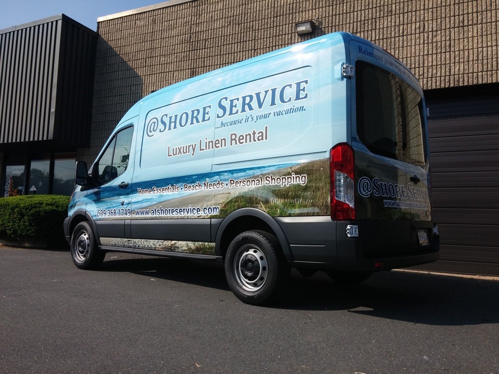
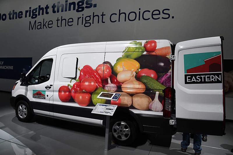
Just as a sign or a business card is an outward facing aspect of your business, so are vehicle graphics. Whether it’s cut lettering or full-size prints, vehicle graphics impart credibility and generate sales. If onlookers don’t need services in the moment, they will in the future. In the 3 seconds there are to read graphics on a moving vehicle, they can stand out more by maintaining or updating vehicle graphics. Keeping them fresh can give the fleet a nice look and keep them working for your business. We’ll go over some cost-effective ways to do that.

Social Media Icons

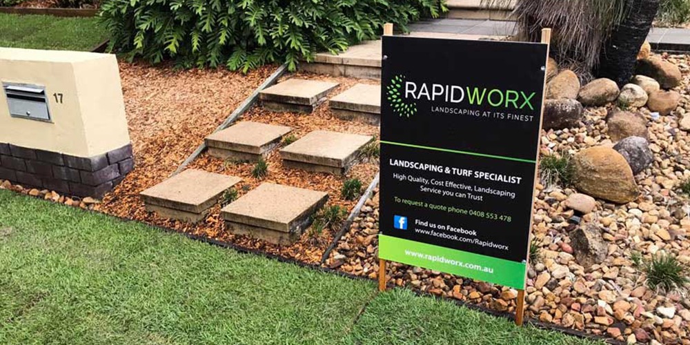
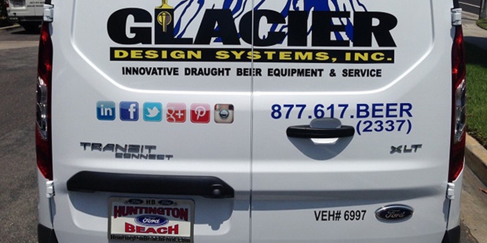
These days, it’s common to see social media icons on brochures, business cards, billboards, and more. Since the web has become a form of mass communication, it has become common to see them used in print and on the web. They add a modern touch to an otherwise solid design. They also provide an extra element to a vehicle’s overall design. Adding an icon adds visual interest because there are more elements interacting with each other. If potential customers are interested in your work, they can check out your Instagram or Facebook.

Small Touches

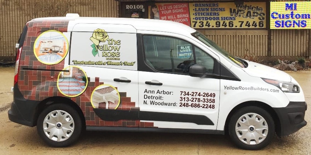
Cut vinyl is cost effective, yet gets the job done. Logos and lettering can be cut and applied without the need for printing. If your fleet has cut vinyl graphics, consider adding a custom shape to the vehicle. It can be a cropped version of the logo, or even a stripe of the company color situated near the end of the vehicle. It can be any shape, really. The vehicles tend to have lines that lend themselves well to designs since the vehicle provides the contour. Adding small touches like cropped logos or contoured shapes are a great way to freshen a fleet and increase visual interest.
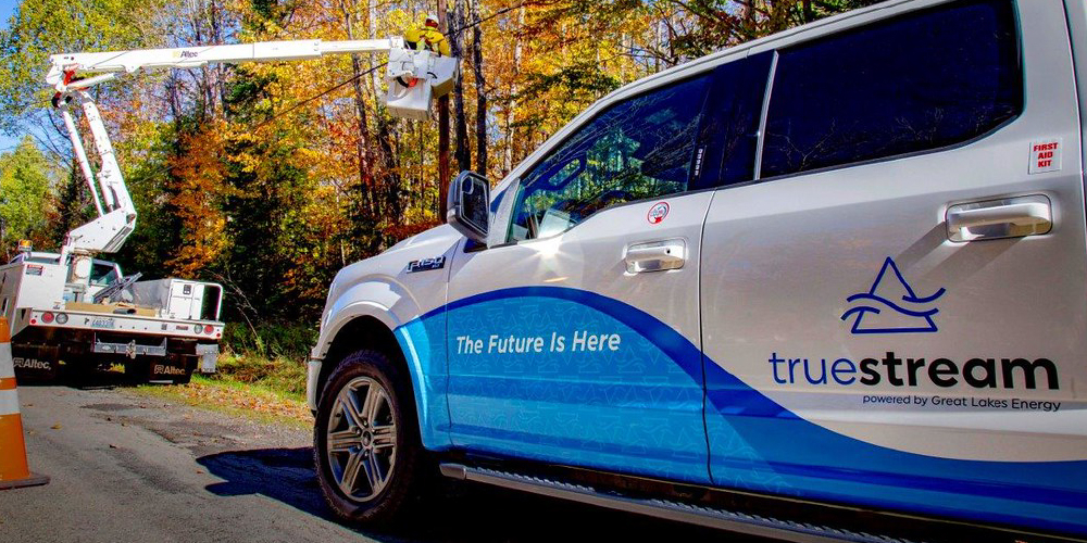
360° Visibility

Another way to freshen vehicle graphics is adding a windshield decal. In traffic, on-comers can get a few as well.  Windshield decals offer another way to add some style to the vehicle. Lettering can be cut and applied, or printed onto a decal that would conform to the window’s shape and dimensions. There are high-visibility colors available. For the rear windows, perforated film is available as well. It can be printed on and allows for outward visibility. Although it’s a more expensive option than cut vinyl, it offers a good solution if you’d like to display printed imagery.

Keeping it Clean

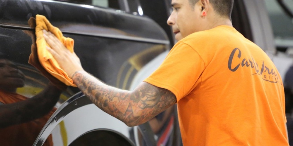
Vehicle graphics are prone to dirt, oils, precipitation, the sun, accidental scuffs. Being vulnerable to the elements, they can peel, crack, and discolor. Washing the vehicle can extend the overall life of the graphics. It’s advisable to hand-wash to protect them. Non-abrasive detergent and a sponge work great. Pressure wash after with a PSI of 2,000 at most. Spraying at an angle of 45° will keep them from peeling. Additionally, keep the water temperature below 140° F and hold the spray nozzle at least 12 inches away from the vehicle’s edges.

Overhauling

Graphics older than 8 years old tend to look weathered and worn. For severely damaged graphics, it may be necessary to do an overhaul. If needed, certain letters can be replaced . However, if the existing graphics are sun faded, it’s best to get new lettering altogether. It’s good to update vehicle graphics every 8 years or go to begin with. People get used to seeing the same fleet after a while so it’s good to shake it up. Updating a fleet’s design will make a familiar company seem new and generate new interest. If a replacement is all that is needed, graphics shops typically have a backlog of designs saved so making replacements is an easy fix. 

Typeface

A typeface is the design of lettering that can include variations in size, weight, slope, width, and so on. Each of these variations of the typeface is a font. There are five main categories of typefaces— sans serif, serif, slab serif, script, and display. Each classification of typeface is ideal for certain scenarios. For example, a script typeface would not fit the visual identity of a bank. However, a sans serif or serif would be a much better choice. There are many, many fonts available. Once a designer ascertains what kind of impression a client wants to elicit, the typeface can look like the perfect one.

Serif

A serif is a slight projection finishing off a stroke of a letter in certain typefaces. It’s also come to symbolize types of typefaces that have those features. They’re also known as “feet.” Serifs are derived from the strokes of pen nibs before the printing press was invented. It’s a readable type of font, making it ideal for books or other long reading. The serifs connect letters together in a way, making it easier to read letters as whole words. Serif typefaces have a more traditional appearance. Because screen resolution has improved in smart phones and desktops, it’s more common to see serifs used online. Before, resolution wasn’t adequate enough to display this typeface class clearly. 

Sans Serif

Sans serif fonts are those that lack serifs. They became popular in the 20th century. The first sans serif font was Akzidenz Grotesk, a font that Helvetica is derived from. Sans serifs are known for their clean, modern appearance. Because of they’re legibility at various sizes, they’re often used in logos, signage, headings, etc. Due to the lack of serifs, the flow of reading long passages of text may lead to fatigue quicker. While legible, they lack as much readability as its serif counterpart. Because of their modern look, they’re used by Nike, Apple, McDonald’s, and much more.

Slab Serif

Slab serifs have the same features as serifs, except this typeface’s is thicker. In the 1800s they were used as headings in posters. They were meant to grab the reader’s attention. Because the thicks and thins of the letters aren’t as pronounced, the letters can have a chunkier appearance, depending on the weight (thickness). This typeface still has the same use it was made for— it’s still great for headlines, but now logos as well. It’s also used to create a distinct look since this classification isn’t as common as the aforementioned ones. It has a unique style that can accentuate existing text or look good on its own.

Display

Display typefaces are meant to look over the top and command attention. They’re used on billboards, buses, menus; any time a large heading is required. They can have an eccentric, exaggerated look compared to the other classifications. The letters may be cut down the middle, or cut at an angle; they’re meant to look unique. Because of their nature, this typeface isn’t used for large bodies of text. Movies use display typefaces a lot to set the scene visually for the movie. Display typefaces can appear distressed, engraved, or have unusual geometry in the letterforms.

Script

Cursive is typically how script fonts are described. Script fonts have the appearance of being hand-lettered with a brush or calligraphy pen. Generally, they’re classified as either formal or casual. They can be ornate, or have a more rounded appearance. Casual script typefaces developed in the twentieth century to mimic the lettering of sign painters. Script typefaces are ideal for headings, book covers, invitations, and even some logos. This typeface is never set in all caps due to illegibility. Handwritten fonts are analogous to this style.

Types of Design

Graphic design is ubiquitous. It’s on the cover of magazines. In signage. Brochures. Vehicle graphics. Cereal boxes. Logos. Any message from a brand, charity, etc. uses graphic design to communicate it. A first impression can make a lasting one on potential customers. It can intrigue, captivate, and spur impulse sales. The qualities of your business can be distilled visually, making for a brand image that’s engaging and unique. 

Corporate Identity Design

Corporate identity design has to do with the identity of a company or business. Any medium displaying the logo, such as business cards, vehicle graphics, and signage fall under this category. Official colors, typefaces, and general aesthetic should be kept consistent. Dissimilar elements between various branding items will create a fractured brand image. A style guide helps maintain  a contiguous look.

Marketing and Advertising

Marketing and advertising is a large aspect of graphic design. Businesses and corporations use it to increase sales, inform of a new product, make announcements, etc. Social media graphics, magazine ads, brochures, billboards, and email marketing are all designed to elicit engagement. If designs are inconsistent between various channels, customers might be reluctant to trust that business with their money. It’s important that the brand identity is consistent through all those channels.

Environmental Design

Environmental design informs or alerts the viewer. Road signs, signage, and event spaces such as trade shows all fall under environmental design. It helps to connect people to their environment. Have you ever stopped at a landmark and read information about it at the location? That’s another example of environmental design. It’s possible to carry the brand identity out into the environment.

Packaging Design

Stickers, folders, and product boxes fall under this category. Imagine if every item in a store were in a white box with plain text describing it. That would be very tough to make out items! Luckily, we have the unique designs of our products to make finding them easier. Stickers are a simple and cost effective way to increase brand awareness. The more people are exposed to marketing materials, the more likely someone else may need your services. 

Web Design

Web design is its own discipline, but graphic design fundamentals carry into web design as well. Typography, color, shape, imagery, and layout are just as at home on the screen. It’s advisable to change a website every 4 to 8 years to keep it from looking too stale. Users judge a book by its website, and if it isn’t easy to navigate or ascertain, they will click elsewhere.

Signs

Signs alert, announce, inform, and create impulse sales. Yard signs are relatively low cost and can reach a large audience. TV and radio ads require both production costs and paid time slots, but yard signs are out 24/7 advertising your business. In addition, yard signs target people in the local area, making it more likely that they’ll become a customer. After clearing it with the homeowner, yard signs also serve as an endorsement of your service. It lends credence to the business and can also spark word of mouth advertising. We’ll go over some tips and tricks to make your yard signage stand out. 

Materials

Yard signs are available in all kinds of sizes and materials. The choice you make depends on their application. It’s basically a matter of permanence. Coroplast is the most common material. They’re made out of fluted polypropylene that’s light weight and withstands the elements. For more permanent applications, sintra board is a good way to go. It’s made of polyvinyl chloride, or PVC. That’s a material suitable for construction yards, development projects, and real estate signage. As an aside, dibond is a material typically used in regulatory signs. There is a wide array of signage materials to choose from at competitive prices. 

Less is More

A yard sign should be short and sweet for it to be effective. Drivers only have seconds to process information before the sign passes them buy. Cramming it with too much information or making text too small can lead to wasted opportunities. As the adage goes, less really is more. Placing them close to the road will make them much easier to see. Having letters at least 3 inches tall will make the sign visible from 30 to 100 feet. On average, it takes seven encounters for people to recall a small business, so placing them throughout your local area can generate additional business. Placed locally, people will have much more than seven encounters! Being local, you’ll be easy to reach and recommend.

Making Them Work

Along with garnering business for your business, a yard sign planted in the customer’s lawn will impart legitimacy. After a job well done, a customer should have no problem having your sign in their grass. If the work was done inside the customer’s home, it’s important to name the type of work the business does, like plumbing or electrical.Since they suggest customer satisfaction, a yard sign is a certification that the work was done well. 18”x24” is a great size. Using company colors, fonts, and aesthetics will instill recall as customers see your vehicle graphics or business cards. Make sure that the integrity of the logo is kept the same and colors and fonts used in other communications are used here as well. Yard signs are another extension of your brand image.

Digital Amnesia

The concept of digital amnesia is relatively new. It describes using technology to “remember” dates, phone numbers, etc. According to Kaspersky Lab, a cybersecurity firm, people are ready to forget important information in the belief that it can be immediately retrieved from a digital device. A quick google search of your business can pull your phone number or address right up. Therefore, include as little information on the yard sign as possible. In light of technology storing information for us, we don’t need to cram signs with information like before. Some businesses are even going as far as eliminating the phone number! In light of digital amnesia, giving people less to remember helps your business be remembered easier.

Graphic Design

Graphic design is used to persuade, inform, educate, and generate sales. It’s a wide-encompassing field that includes everything from brochures and business cards to vehicle graphics and the website. Plus, design is also used for labels, stickers, window displays, trade shows, and much more. In today’s competitive climate, cultivating visual curb appeal can influence how customers make decisions. It takes 5 to 7 encounters to make an impression on a potential customer. While communicating with them, the messaging will be enhanced by accompanying branding elements. With technology at our disposal, along with printed media as well, there’s never been as many channels to promote your brand. 

Printed Media

Flyers, business cards, brochures, postcards, etc. are easy ways to put your business out in front of potential customers. Billboards even fall under printed media! They could inform of a sale, display prices and capabilities, list pricing tiers, and make an impression. The fonts, colors, graphic styles, and style of imagery used across different media can all give an impression with each encounter. When designs are consistent, the brand image will be as well, and that allows for better brand recall and recognition. Whenever communicating with your target market, tailored messaging to them will create a personal touch that will make it sound real. Think about the mission statement and infuse that tone into it.

Vehicle Graphics

As far as cost per thousand impressions, nothing beats vehicle graphics as an advertising medium. Essentially, they are mobile billboards. Unless you’re at a light or the vehicle is parked, there isn’t much time to read a whole lot of graphics. With that in mind, it’s best to keep the amount of information to a minimum. The logo, phone number, and website are all that is required for effective vehicle graphics. Full or partial wraps are used for impact, but minimal-looking graphics can also be effective. Even just fields of the company color will do the trick. Simple soap and water are all you need to keep vehicle graphics looking their best.

The Web

People are using the internet to find the services they need at a price they can afford. Being online will increase ROI and provide an easier way for customers to get in touch. Not only that, but having a website helps serve as a means for search engines to find you when people search for terms to find your business, like landscaping or counter installers. Just like print media and vehicle graphics, the website should coincide with the branding of everything else. Including easy to find contact information, a call to action, and a clear description of what you do are some of the basics of a website. Without one, it’s much harder to appear in a search. Finding out the social media that your target customers use will help to reach even more people. Branding and messaging should be used here as well. 

Signage

Signage is any type of graphic display used to convey information to an audience, whether they’re employees or customers. Signage used at a business’s facility helps make navigation easy and presents where to go in a way that’s on brand. It’s important to use the same branding from the brand guide such as fonts, colors, and size ratios between all the elements. When designing signage to be used after a job at a customer’s home, displaying the logo and contact information in a stylistic way will let the neighbors know you did the work. A polished brand identity elicits good impressions that make for more leads in the long term. Signage can be made from all types of different materials and finishes, but yard signs are typically made from coroplast. 

Better Website

According to Statista, 287 million people use the internet. As people search for goods and services, opportunities would pass those who lack a website. Your website is the digital location of your business. It’s where customers go to find out more about what you do, how, when, where, and maybe even why. All the information customers need is right there. Just like a clean business card or dynamic vehicle graphics, a business’s website is another extension of it. Having a website is one thing, but having one that increases response and engagement is another.

Your Website

The company website should be treated just like any other marketing material. It’s a place where your business’s DNA can be infused digitally. Being a part of the brand identity, you’d want to elicit the same impression from the website as the business card. All colors, typefaces, styles, and imagery should be in line with the rest of the branding. If there’s disconnect, a fractured brand image would result. A branded website adds credibility to the business and lets people know you’re for real.

Digital Branding

Branding the website properly is important. Equally so is having all pertinent information easily accessible to the visitor. 97% of consumers use the internet to find a business. If they can’t find how to contact you within the first few seconds of being on the site, they’ll look somewhere else. The phone number, email address, and address should be displayed prominently for easy viewership. Including the story of your “why” will get people engaged and interested in what you offer. Details such as offerings, services, etc. can have their own page of the site as well. 

Search Engine Optimization

SEO is the other half of the equation. It doesn’t matter how well the site is laid out or how much information it contains if no one can find it through search. Search Engine Optimization lets browsers know that your digital space exists. One of the tenets of SEO is the keyword. Keywords are comprised of words that people would search for to find your business. It’s important to speak the language of your customers. If you’re a landscaper in Rochester Hills, that can be included in the meta description of the site. Basically, that’s the blurb of what the site’s about when you make a Google search. Having solid SEO will increase web presence and lead to conversions.

Bringing it Together

The website can serve as the digital hub of your internet presence. Connecting social media to it will also increase web presence. Even SEO! People like to see the inside of a business. There’s a human element people appreciate knowing they’re still involved in the day to day. Your story can be told post by post. Having a social media presence instills trust in consumers. It’s in the business’s best interest to be reachable through multiple mediums. The same DNA from the brand identity can be used on social media as well. It’s not necessary to be on every platform, but seeing what platforms customers use can help tailor marketing to those people. See us if you feel you need to upgrade your online presence. 

Brand Elements

Brand Image

Style guides ensure that any time someone sees your business’s branding, it’s consistent every time. They spell out the rules of how branding should be portrayed. Style guides typically include how to display the logo in terms of size and spatial distance between it and anything else. Accordingy, how not to use the logo is communicated as well. Photography can take on its own aesthetic and it’s important to include that as well. Colors used are specified also, listing attributes such as its HEX number. Typefaces of headings and body text are listed, including size and proportion to one another.

Brand Voice

A brand’s “voice” is the tone of its messaging. Identifying the target market helps create custom messaging that appeals to them as people and consumers. Lots of companies create personas of their target customer and conduct research about that demographic, like how old they are, marital status, hobbies, etc. Using that knowledge to establish tone will create a following of people who resonate with the brand. Keeping the mission statement in mind will also drive results from messaging. The who, what, where, and why of your business can drive the business forward as it communicates to customers. 

Guide the Wave

Style guides exist to keep a brand’s visual identity in sync between its many components. No matter if viewed from a business card, a brochure, or from Facebook, the brand’s visual identity should be cohesive. Establishing the visual identity will make it much easier to carry out if a style guide is in place. Logo sizes will be uniform, typefaces will carry over, colors will have been established; it makes creating branding materials that much easier when there’s a strategy involved. They keep the team aligned with the goal and vision. When everyone is on the same page, results are always better than when there is disconnect.

Putting it Together

Having a style guide is critical for maintaining a cohesive brand image. Imagine if you got two different looking business cards from the same place. Or vehicle graphics that are dissimilar. A fractured brand image creates confusion. Keeping all sorts of elements in line between various channels is hard, but a style guide keeps everything streamlined. All the guesswork is taken away when visual qualities like logo orientation, colors and typefaces used, and style of imagery are established. Once a style guide is made, it only has to be followed to keep the visual identity cohesive and impactful. A well-manicured brand identity elevates position in customer’s minds.

Design Trends

Needless to say, 2020 has been a heck of a year. According to Fortune.com, nearly 100,000 establishments were put out of business due to the Covid 19 shutdown. Fortunately for others, business continued despite the pandemic. The shutdown has allowed other businesses to evolve and adapt to the new conditions of quarantine. Nowadays, design is just as rich in digital form as it is in print. As 2020 is hindsight now, we’ll look back at some design trends that have emerged in the print and digital media spaces.

Simple Illustration

Illustration has been used in graphic design since time immemorial to advertise, promote, clarify concepts, and more. In 2020 we’ve seen simple illustrations being used in layouts in print and on the web. Coinbase uses them to clarify concepts as new traders educate themselves on cryptocurrency. Simple illustrations help add visual atmosphere to the message. They make the reading more engaging and sets the tone. Simple shapes and lines are the basic ingredients in this minimal style of illustration.

Simple Illustration

Super Minimalism

In the 2010s we’ve seen the explosion of flat design set off by Microsoft. It’s unobtrusive layout structure and simple design has made it ideal for digital interfaces. It’s a far cry from the skeuomorphic aesthetic of the 2000s. In 2020 we’ve seen the flat design aesthetic taken up another level. Used mainly for digital interfaces, single color backgrounds have come to replace grids to make it easy for people to navigate content. Legible type and cool illustrations add context and visual pizazz to the otherwise blank background.

Super-Minimalism

Liquids and Gradients

As opposed to the structural layout of flat design, liquids and gradients are used to add a free-flowing look. Primarily used as backgrounds, this trend is used in both print and online layouts. The juicy colors and flowing shapes add a unique sense of visual interest. It’s a hip, clean look. Contrasted with crisp sans serif typography and hard alignments, information stands out against the background. Different degrees of detail can be used for the desired amount of viscosity. It can be just a simple swoopy shape or a densely illustrated liquid.

Liquid

Nature-Inspired

Layouts for print, web, and packaging have used nature-inspired layouts to bring the outdoors indoors. Simple flower, leaf, and plant illustrations add an organic feel to a design. They can be detailed with color, monochrome, made with a simple vector, and everywhere in between. Earthy colors like sage, burnt sienna, and light blues are utilized as well. Colors of flowers are also used in designs, making them more intriguing. The nature elements can be used to whatever extent fits the design.

Bold Typography

This style of layout has a bold, expressive presence. Letters can be distorted, offset, enlarged; nothing is out of the question with this extreme trend. It’s not uncommon for smaller text to sit within a widened letter. With nothing to contend with, the type is free to be set however dynamically the design is fit for. It can get to look chaotic but alignments are used to give the type connection.

Digital Layout

Digital layout is the arrangement of elements on a page which makes up the content of a design. Elements can include photography, text, shapes of color, and any combination of those. Menus, brochures, websites, billboards, magazine ads, etc. have all been laid out using aesthetic principles like alignment, repetition, contrast, and proximity. Even documents like invoices have been laid out to make filling them out and ascertaining them easy.

Typography

Typography goes a long way in making any kind of lay out strong and appealing. Times, Helvetica, and Myriad Pro are used quite often, but there are tons of other typefaces out there that have a professional, polished, and distinctive look. Leave it to the designer to  find the kind of typeface you’re looking for. Based off what kind impression you want to elicit, they’ll search through dozens finding the perfect one. 

Color

Color is powerful in setting the emotional tone in a design. Any amount can go a long way. Incorporating your company colors in any capacity adds visual appeal to even a “boring” document. Using color can help make them more clear and establish identity. It can even be used for layout. Horizontal bars of color can divide lines of text, making it easier to read. Color can be used to help structure information and add visual flair.

Photography

Like color, photography can add emotional tone to a design. In addition, it’s used to display relevant imagery. Photos make it clear what kind of business you’re in and informs customers of what products or services you offer. Photoshop has made it possible to manipulate images to make them pop and arrange elements in a custom way. In addition, it can be used to create effects like gradients to seamlessly mesh with colors. Sites like Shutterstock and Adobe Stock offer a wide array of images.

Shapes

The shape of an area of color, or the shape of an image applies to the concept of layout as well. As an additional element, it can be used to make designs more dynamic and interesting. Shapes are also used to incorporate color. A horizontal bar on a business card, or a text with a color background can help structure information, making it easier to read and more appealing to look at. 

Pulling it all Together

Any combination of typography, color, photography, and shape comprise layout. Without attention to it, designs would look bland, uninteresting, and ineffective. When laid out according to pre established parameters like who to reach, communication will help the design be read and lead to a phone call or a sale. Restaurant menus and anything at stores would look dull if it weren’t for layout to distinguish brands and businesses from others.

Graphic Communications 40th Anniversary

Graphic Communications is celebrating its 40th anniversary this year. In this forty years, the graphic design industry as a whole has been through a revolution. Graphic Communications has been at the forefront of it from the days of manual design and layout, including sign and truck lettering. Advances have been made that exponentially expedited the time it took to produce layouts for print and vehicles. Namely, the invention of the Macintosh computer and Adobe Software, and improvements in vinyl graphic production. As we reflect on the past four decades, we’ll also examine changes in design. 

PreMac

Design and layout of images and lettering used to be a laborious and tedious process before the advent of the Mac. Some tools of the trade include x-acto knives, drawing tables, tweezers, rubber cement and solvent, and pens and pencils. The copy and paste command on a computer was executed literally. Rubber cement was applied to the back of the image or text and pasted meticulously in place, and tweezers were used for repositioning. When adding text to a printed piece a typographer was hired to print fonts of various sizes, weights, and classifications. Images were edited during the printing phase with the addition of Pantone colors. If there was a mistake in a document it was much more of an involved fix than it is today. However, triple checking our work hasn’t changed at all.

Automation In Graphic Design

Adobe Photoshop, Illustrator, and InDesign have changed the course of graphic design as we know it. All the manual design and layout processes were replaced digitally. The Mac was the machine that ran these programs, still among the most widely used layout tools today. Loads of time was saved with the streamlined production, allowing designers to focus on the creative aspects instead of production. Rather than manually manipulating photos, it became possible to do so in Photoshop. Perfect, mathematically governed shapes could be produced in Illustrator. Ads, articles, and books could be typeset and keylined in InDesign. The Mac and the Adobe Suite paved the way for how subsequent graphics would be produced. Inhaling toxic fumes from rubber cement and other chemical agents became a thing of the past. The technology wasn’t adopted right away; some major publications took years to transition from analog to digital. 

Vehicle Graphic Capabilities

Vehicle graphics as we know them today got their start in the 1980s. Before that, graphics were painted onto vehicles. After KPMF invented cast vinyl films for Germany’s fleet of taxis, another revolution was under way. Initially, the cast vinyl material was unforgiving to work with. It would stick easily with accidental contact and it was too thick to be pliable enough for contoured surfaces. Over time though, manufacturers like 3M, Avery Dennison, and Oracal have developed films with air channels that made the vinyl easier to reposition while also mitigating bubbles. The air channels are created using microscopic beads that don’t pop until squeegeed, solidifying the bond. Die cutting made it possible to cut shapes of any intricacy. It took a while for printed media to catch up though. Imagery was screen printed onto vinyl; also a manual process. The electrostatic printer was invented in the 1990s, which allowed for full color printed imagery on any vehicle. 

Graphic Communications has seen many design trends come and go over its four decades. The eighties was filled with futuristic colored chrome, sharp typefaces with a shadow effect, and abstract patterns. It was also wrought with shapes superimposed against patterns and loud colors. The nineties, where computers were taking their stronghold, brought with it neon colors, and a combination of psychedelic and cyberpunk motifs. Breaking the rules of graphic design— alignment, repetition, contrast, and proximity— was lauded in the nineties aesthetic. Designs had dirty backgrounds, distressed fonts, real life imagery, and cut outs. In the two-thousands, screens started proliferating through society, and a need for design for them specifically arose. Typefaces were more legible and colors were reduced to one or just a few. In the twenty-tens design had come to the clean aesthetic we see today. Microsoft helped to pioneer it through what’s become known as “flat design.” It was designed for screens, so simple, clean color palettes were chosen and rectangles with the same gutter were used either for blocks of color with type inside, or images. We’re looking forward to what the next decade brings at Graphic Communications!