
A typeface is the design of lettering that can include variations in size, weight, slope, width, and so on. Each of these variations of the typeface is a font. There are five main categories of typefaces— sans serif, serif, slab serif, script, and display. Each classification of typeface is ideal for certain scenarios. For example, a script typeface would not fit the visual identity of a bank. However, a sans serif or serif would be a much better choice. There are many, many fonts available. Once a designer ascertains what kind of impression a client wants to elicit, the typeface can look like the perfect one.
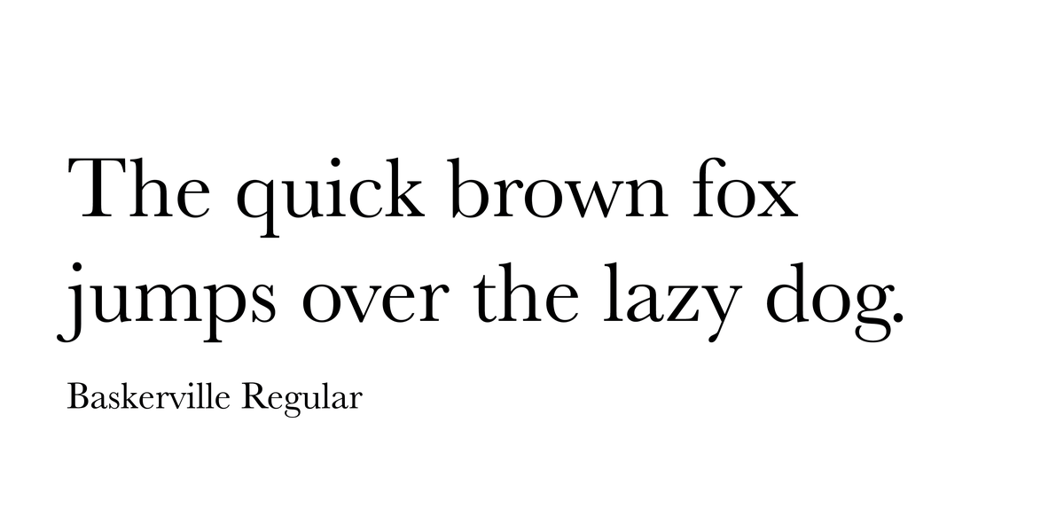
Serif
A serif is a slight projection finishing off a stroke of a letter in certain typefaces. It’s also come to symbolize types of typefaces that have those features. They’re also known as “feet.” Serifs are derived from the strokes of pen nibs before the printing press was invented. It’s a readable type of font, making it ideal for books or other long reading. The serifs connect letters together in a way, making it easier to read letters as whole words. Serif typefaces have a more traditional appearance. Because screen resolution has improved in smart phones and desktops, it’s more common to see serifs used online. Before, resolution wasn’t adequate enough to display this typeface class clearly.
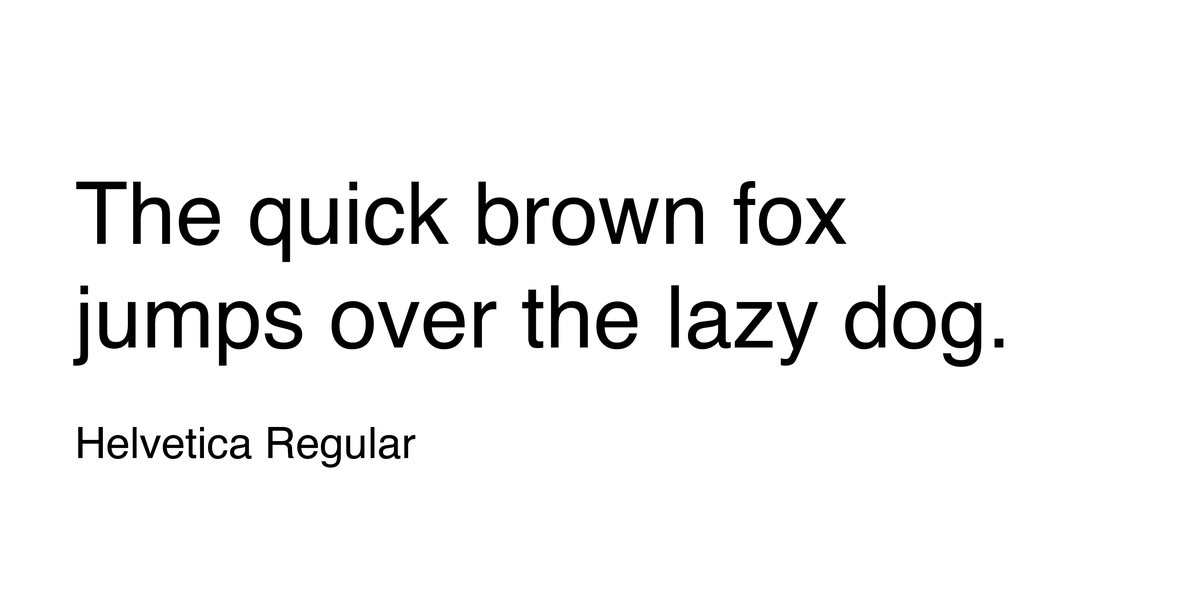
Sans Serif
Sans serif fonts are those that lack serifs. They became popular in the 20th century. The first sans serif font was Akzidenz Grotesk, a font that Helvetica is derived from. Sans serifs are known for their clean, modern appearance. Because of they’re legibility at various sizes, they’re often used in logos, signage, headings, etc. Due to the lack of serifs, the flow of reading long passages of text may lead to fatigue quicker. While legible, they lack as much readability as its serif counterpart. Because of their modern look, they’re used by Nike, Apple, McDonald’s, and much more.
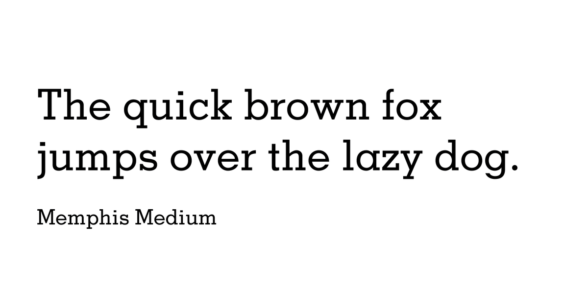
Slab Serif
Slab serifs have the same features as serifs, except this typeface’s is thicker. In the 1800s they were used as headings in posters. They were meant to grab the reader’s attention. Because the thicks and thins of the letters aren’t as pronounced, the letters can have a chunkier appearance, depending on the weight (thickness). This typeface still has the same use it was made for— it’s still great for headlines, but now logos as well. It’s also used to create a distinct look since this classification isn’t as common as the aforementioned ones. It has a unique style that can accentuate existing text or look good on its own.
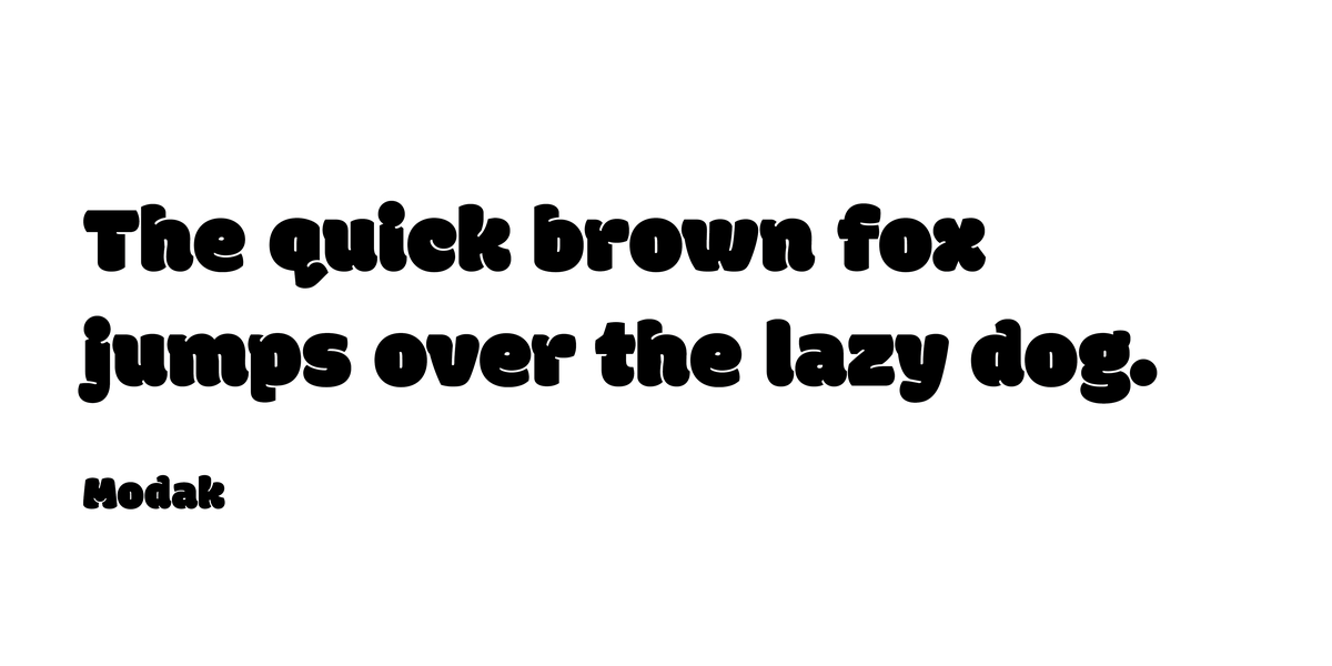
Display
Display typefaces are meant to look over the top and command attention. They’re used on billboards, buses, menus; any time a large heading is required. They can have an eccentric, exaggerated look compared to the other classifications. The letters may be cut down the middle, or cut at an angle; they’re meant to look unique. Because of their nature, this typeface isn’t used for large bodies of text. Movies use display typefaces a lot to set the scene visually for the movie. Display typefaces can appear distressed, engraved, or have unusual geometry in the letterforms.
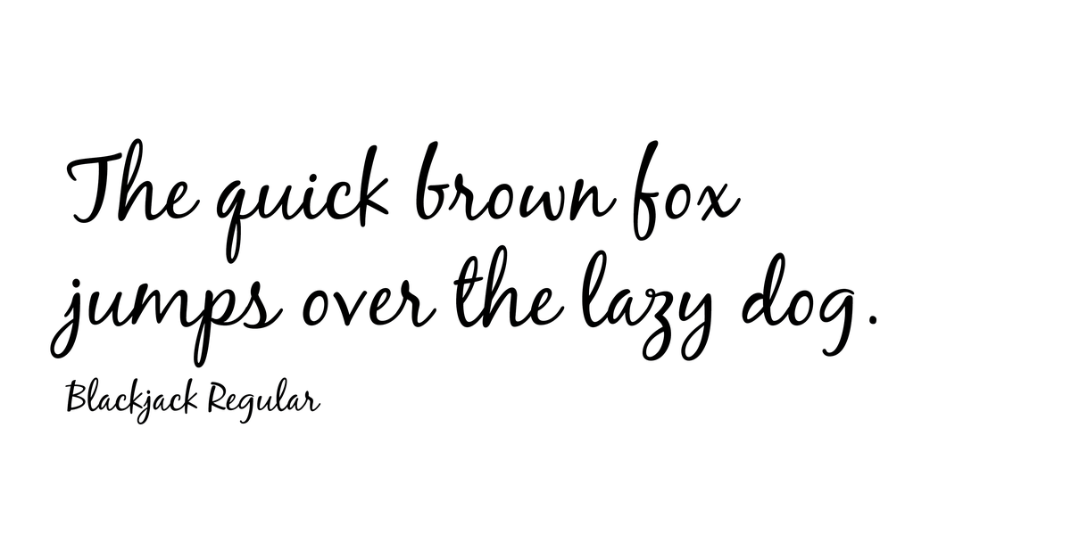
Script
Cursive is typically how script fonts are described. Script fonts have the appearance of being hand-lettered with a brush or calligraphy pen. Generally, they’re classified as either formal or casual. They can be ornate, or have a more rounded appearance. Casual script typefaces developed in the twentieth century to mimic the lettering of sign painters. Script typefaces are ideal for headings, book covers, invitations, and even some logos. This typeface is never set in all caps due to illegibility. Handwritten fonts are analogous to this style.
