Needless to say, 2020 has been a heck of a year. According to Fortune.com, nearly 100,000 establishments were put out of business due to the Covid 19 shutdown. Fortunately for others, business continued despite the pandemic. The shutdown has allowed other businesses to evolve and adapt to the new conditions of quarantine. Nowadays, design is just as rich in digital form as it is in print. As 2020 is hindsight now, we’ll look back at some design trends that have emerged in the print and digital media spaces.
Simple Illustration
Illustration has been used in graphic design since time immemorial to advertise, promote, clarify concepts, and more. In 2020 we’ve seen simple illustrations being used in layouts in print and on the web. Coinbase uses them to clarify concepts as new traders educate themselves on cryptocurrency. Simple illustrations help add visual atmosphere to the message. They make the reading more engaging and sets the tone. Simple shapes and lines are the basic ingredients in this minimal style of illustration.

Super Minimalism
In the 2010s we’ve seen the explosion of flat design set off by Microsoft. It’s unobtrusive layout structure and simple design has made it ideal for digital interfaces. It’s a far cry from the skeuomorphic aesthetic of the 2000s. In 2020 we’ve seen the flat design aesthetic taken up another level. Used mainly for digital interfaces, single color backgrounds have come to replace grids to make it easy for people to navigate content. Legible type and cool illustrations add context and visual pizazz to the otherwise blank background.

Liquids and Gradients
As opposed to the structural layout of flat design, liquids and gradients are used to add a free-flowing look. Primarily used as backgrounds, this trend is used in both print and online layouts. The juicy colors and flowing shapes add a unique sense of visual interest. It’s a hip, clean look. Contrasted with crisp sans serif typography and hard alignments, information stands out against the background. Different degrees of detail can be used for the desired amount of viscosity. It can be just a simple swoopy shape or a densely illustrated liquid.

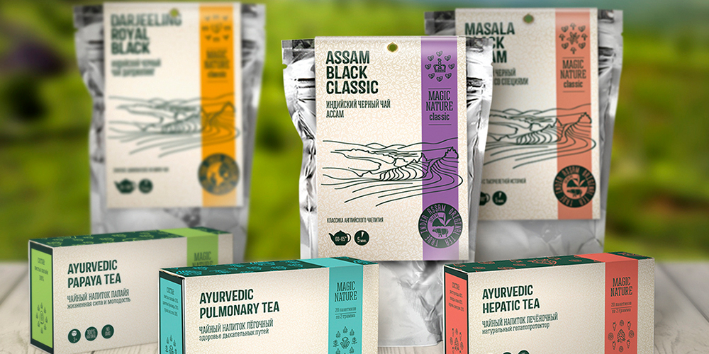
Nature-Inspired
Layouts for print, web, and packaging have used nature-inspired layouts to bring the outdoors indoors. Simple flower, leaf, and plant illustrations add an organic feel to a design. They can be detailed with color, monochrome, made with a simple vector, and everywhere in between. Earthy colors like sage, burnt sienna, and light blues are utilized as well. Colors of flowers are also used in designs, making them more intriguing. The nature elements can be used to whatever extent fits the design.
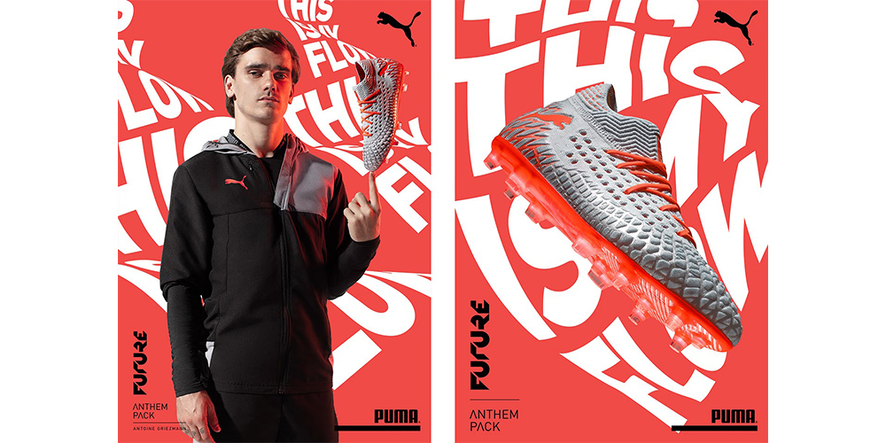
Bold Typography
This style of layout has a bold, expressive presence. Letters can be distorted, offset, enlarged; nothing is out of the question with this extreme trend. It’s not uncommon for smaller text to sit within a widened letter. With nothing to contend with, the type is free to be set however dynamically the design is fit for. It can get to look chaotic but alignments are used to give the type connection.