Typography
Typography goes a long way in making any kind of lay out strong and appealing. Times, Helvetica, and Myriad Pro are used quite often, but there are tons of other typefaces out there that have a professional, polished, and distinctive look. Leave it to the designer to find the kind of typeface you’re looking for. Based off what kind impression you want to elicit, they’ll search through dozens finding the perfect one.
Color
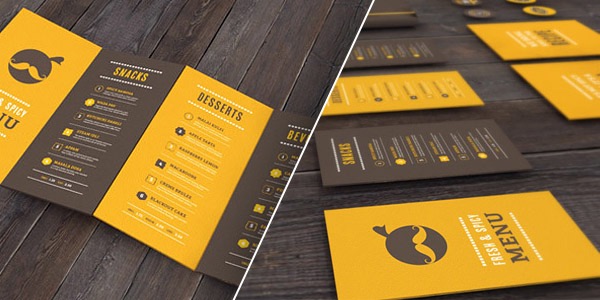
Color is powerful in setting the emotional tone in a design. Any amount can go a long way. Incorporating your company colors in any capacity adds visual appeal to even a “boring” document. Using color can help make them more clear and establish identity. It can even be used for layout. Horizontal bars of color can divide lines of text, making it easier to read. Color can be used to help structure information and add visual flair.
Photography
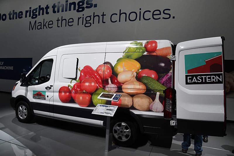
Like color, photography can add emotional tone to a design. In addition, it’s used to display relevant imagery. Photos make it clear what kind of business you’re in and informs customers of what products or services you offer. Photoshop has made it possible to manipulate images to make them pop and arrange elements in a custom way. In addition, it can be used to create effects like gradients to seamlessly mesh with colors. Sites like Shutterstock and Adobe Stock offer a wide array of images.
Shapes
The shape of an area of color, or the shape of an image applies to the concept of layout as well. As an additional element, it can be used to make designs more dynamic and interesting. Shapes are also used to incorporate color. A horizontal bar on a business card, or a text with a color background can help structure information, making it easier to read and more appealing to look at.
Pulling it all Together
Any combination of typography, color, photography, and shape comprise layout. Without attention to it, designs would look bland, uninteresting, and ineffective. When laid out according to pre established parameters like who to reach, communication will help the design be read and lead to a phone call or a sale. Restaurant menus and anything at stores would look dull if it weren’t for layout to distinguish brands and businesses from others.